Notes from GiantConf 2014’s RWD workshop with Brad Frost

In his RWD workshop this last weekend at GiantConf 2014 Brad Frost plowed through the history, current state, best practices and possible futures of the RWD philosophy/approach. Here are my notes from his talk.

June 14, 2014

His experience: web on mobile for 4+

  • Responsive Design Patterns
  • ThisIsResponsive.com website and github (http://bradfrostweb.com/blog/web/this-is-responsive/ & http://bradfrost.github.io/this-is-responsive/index.html)
  • (older site) – Mobile web best practices
  • WTF Mobile Web (what not to do)
  • Cosigner of Future Friendly Manifesto
  • Worked for R/GA at one point…showed the company logo slide to illustrate that no one knows what they’re doing.

General Landscape

  • i6bb mobile subscriptions
  • in america, 91% of americans have a mobile… 56% of those are smart phones.
  • 1.5 mm android activations a day
  • 1/3 americans have an ereader/tablet
  • 20% of ALL internet traffic is mobile
  • 68% of americans access the web via phone
  • 33% of those ONLY use the mobile web
  • Mobile web pictogram –
  • 157mm users ONLY use FB from their mobile
  • What are we sharing from mobile on social? (text photos videos and LINKS)
  • 51% of referral traffic to media sites came from FB mobile
  • blog.cloudfour.com – good status on mobile – a comprehensive guide

Approach – Options

  • Do nothing. (rant: cultivating a nation of slide swiping screen surfing zombies)
  • Make an APP!
    • App glut
  • Links don’t open apps
  • pros and cons of course
  • Separate Design Experiences (Nielsen’s advice, to build two sites and cross-linking to make it work.)
    • more dedicated, optimized, catered experience
    • no need to adapt
    • potential to be more performant
    • url redirection (getting a mobile version of a site on your desktop due to a link given to you)
    • content parity
    • content governance
    • device database
    • SEO issues (better to keep your links under the same single site)
    • Continuity issues
    • The Space Between (kindle fire, etc.)

Strategy

  • Build a barebones mobile responsive site, and grow it over time.
    • eventually kill the old clunky desktop site
  • Responsive retrofitting a site
    • j spool’s ‘escalator of acquired knowledge’ (people hate when you completely tear down and rebuilt their beloved sites)
  • Mobile First (progressively enhanced, future friendly, awesome)
  • Piecemeal approach: “our responsive header is almost done”
    • seen on really huge sites in recent times. footer, header, module by module
    • acclimatizes the user
    • he’s only seen it in large companies, but he thinks it could work very well for small
    • companies/sites/teams, perhaps more so.

Foundations

  • Ethan Marcotte @2010 in ALA
  • Fluid Grids, Media Queries, Flexible images
  • the Fluid grid should do most of the heavy lifting! (don’t go crazy with media queries!)
  • Context is needed
    • Adaptive is a bigger container than responsive, and itself contains responsive
  • There are other parts, but RWD is what stuck.
    • Feature Detection
    • Server side components*
    • interdevice communication
    • performance, etc.

Principles of Adaptive design

  • ubiquity (this is for everyone, for anyone, for us all
    • diversity is not a bug, it’s an opportunity) – step reiger
    • mobile users will do everything desktop users do, if it’s accessible.
    • Content parity
    • Context
      • Quantitative
      • Qualitative
  • flexibility
    • embrace the squishiness
  • performance
    • 71% of mobile users expect mobile sites to load as fast or faster than desktop sites
    • you have 5 seconds of someones time…
  • Future friendly – Invest in your content. -> Make APIs, not war

Frameworks

  • Bootstrap, Foundation by Zurb, etc.
  • Jetstrap/Bootkit
    • these are all well and good, but lead to look alike issues
    • One-size-fits-all
    • Potential for bloat/unneeded stuff
    • might not do what you need
    • integration issues
    • have to subscribe to someone else’s decisions
  • Tiny Bootstraps, for every client. – Dave Rupert
  • Front end style guides
  • promotes consistency cohesion
  • easier to test
  • better workflow*
  • creates a shared vocabulary
  • useful reference
  • Lots of front end style guides coming out (started with starbucks. starbucks.com/static/reference/styleguide)
  • problems with these:
    • Time consuming to create
    • treated as an auxiliary project
    • often too abstract
    • often seen only as a designer/development tool
    • created after a project launches
    • often incomplete, only serving present use cases
    • often lack a clear methodology
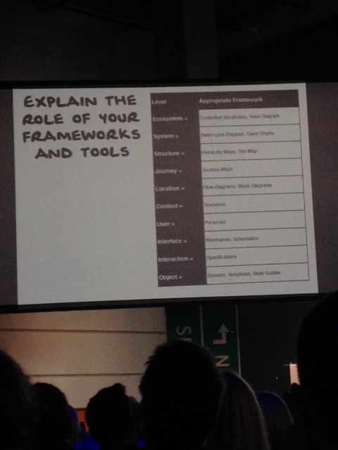
Atomic Design

  • josh duck’s periodic table of html elements
  • @dmolsen
  • Abstract ————————-> Concrete
  • Creators ————————-> Clients
  • Atoms, Molecules, Organisms, Templates, Pages
  • Reference, Build, Build, Build, Reference

the pattern

  1. ATOMS (input field)
  2. Molecules (search module)
  3. Organism (site header)
  4. Templates (site header bundled into a whole page template) -focus on content structure (reference to mark boulton.co.uk – content strucure first, not required to have content first)
  5. Pages (the pouring in of real & true representative content to see if it all works)
  • validate or invalidate the atomic design thus far
  • you test variations of the template at this point (still the same template though!)
  • does it scale? (content length, list item length, etc.)

pattern lab

  • @dmolsen Dave Oldsen and Brad created it
  • Open source project
  • What is it?
    • It’s a design system BUILDER
    • designed to help you execute a design system
    • a custom component library
    • a pattern starter kit
    • a practical viewport resizer
    • an annotation tool

It’s NOT:

  • a UI framework
  • Language, library, or style dependent
  • Incredibly rigid
  • “just” a pattern library, but also not a prod ready static site generator
  • ..like Jekyl

moving parts

  • builder
      mustache for templating the guts

      JSON for piping in real content

  • viewer
    • ish (gives you a different value every time (small button gives you a smallISH value)
    • Lets you rapidly preview random and different layout scenarios
    • displays the size of the display currently in view.. as px and ems. Annotations
    • his issues with wireframes in general… long assed annotations, iXds are working in a layer of abstraction
    • The annotation tool couples numbers with an overlaid layer of annotated description
    • Annotations with JSON
    • Lineage
    • Shows off what components make up a particular component, and where its applied.
      • ‘X pattern contains the following patterns’
      • ‘x pattern is included in the following patterns’

Other stuff

  • code view
  • pattern status
  • auto refresh
  • page follow
  • Future: plugins
  • idea of checking your performance budget whilst developing with Pattern Lab

What’s the hardest aspect of responsive web design?

  • design/dev or people/process (overwhelmingly process/people)
  • Entertainment Weekly
  • you have to sell people that RWD is the right thing
    • using data (showing conversions, improvement metrics – hockey sticks)
    • SHOWING not TELLING is a lot easier to sell through to clients
    • talk about the simplicity of the 3 pillars (flex grid, resp images, media queries)
    • why RWD matters, selling to Tiffany in his R/GA days:
      • He took a representative page from their site… (their desktop site), and demoed how it COULD be if set up properly
        • It took him half a day…
        • they then took a crapload of devices and spread them out on a long table… two tabs open on each device one for now vs possible Set Expectations
      • Don’t sell websites like a painting. Instead, sell easy and sexy access to content, agnostic of device, screen etc.
      • Kill the waterfall! IA->VISUAL->DEV = no good Interface Inventory
  • Much like a content inventory, but more specific
  • pick out, cluster, and inventory the buttons, inputs etc. – this illustrates the differences, similarities, the scope of the current interface situation
  • This helps you gauge LOE on a redesign!
  • Document your interface
  • Promote consistency
  • Establish which elements will be challenging to translate into RWD
  • lays groundwork for future style guide/pattern library
  • Evernote for Interface Inventories – Aaron Gustafson

Establish Direction

  • before too long, you can design for the content structure you KNOW will exist
  • use of style tiles for visual direction – more specific than a mood board, but not getting too far down into the weeds
  • use of Typecast for brainstorming and playing with potential typographic treatments

Rolling up your sleeves

  • build out basic patterns based on design sketches
  • moving into element collages (still not full comps)
  • often start with header and footer
  • often end up with odd states.. ie a finished header and footer but very rough main content well – this requires frequent communication with client so they know how the process is flowing
  • A traditional comp might not happen until nearly the end of design process …and might be a coded comp vs a photoshop comp

Responsive Patterns

  • he collected design patterns, in b&w & very barebones. (thisisresponsive.com)
    created to avoid re-explaining patterns again and again Layout

Grids

  • Which grid system should i use? (he doesn’t care 😉
  • Css tricks.com don’t overthink it grids
  • Future of CSS Layout
  • Grid Layout
  • Flexbox (see solvedbyflexbox.com)

Media Queries

  • avoid desktop-first styles (don’t set defaults only to have to overwrite them!)
  • mobile first styles start from the perspective of small (using min-width vs max-width)
  • the absence of support for media queries is in fact the first media query. – Bryan Rieger
  • Let CONTENT, not screen size, determine breakpoints
  • Start with the small screen first, then expand until it looks like shit. Time for a breakpoint! – stephen hay
  • HAY mode in Ish (in hay’s honor)
  • use of EMs in media queries – no longer a strict best practice, but a matter of preference
  • Still recommend using relative units (he has no pixel values in his styles)
  • Use major AND minor breakpoints (minor being a component level breakpoint or page level breakpoint)
  • don’t overdo it
  • ??? about localization and media query usage (german text is longer….)
  • option 1: use the longest localization by default (his recommendation)
  • option 2: apply a differentiator (addl class on the body tag etc.) and add/modify german specific styles Multi-Device Layout Patterns

Mostly Fluid patterns

  • The Column Drop
  • be careful that the stuff in the sidebars isn’t necessarily related to the main content (due to content hierarchy concerns)
  • The Layout Shifter (brad voids these if possible, preferring simplicity)
  • ie a complex, unique layout that really changes across breakpoints
  • Tiny Tweaks – ie very little changes..
  • minor font size or margin changes
  • The Off Canvas (jason weaver – jasonweaver.name/lab/offcampus)
  • stuff hangs out off screen until needed
  • Content Choreography
  • content folding (ie folding ads in between articles)
  • could use flexbox (jordanm.co.uk/lab/content)
  • could use AppendAround: a responsive Markup Pattern
  • from Filament Group
  • Don’t use this all the time, but it could help solve certain issues

Layout considerations

  • When users scroll on mobile we are moving backward through time
  • moving through a list
  • deep dive into content
  • All these instances are scrolling through a singular content type
  • don’t mix up your content types when you put stuff into a single column with RWD.

Conditional loading:

  • given the % of sites that push the same heavy content to mobile as desktop…
  • Aggressive enhancement (nice term)
  • The Thing (a) beside and above NOT The Thing
  • Instead, include links to the “not the thing”s by fragmenting out that content
  • put these fragments behind a lazy load and a user opt-in (via accordion for example)
  • old browsers treat as links to different pages
  • newer stuff fetches via ajax and drops it into the expanded module
  • Larger format views display the whole thing by default
  • (24ways.org/2011/conditional loading for responsive designs)
  • Boston Globe does this with their weather widget
  • either drives to a different page OR
  • displays inline via async call How to do this?
  • Matchmedia.js (has polyfills too)
  • enquire.js
  • Conditional CSS (adactio)
  • Progressive disclosure as a term http://en.wikipedia.org/wiki/Progressive_disclosure
  • Scanability vs capability is a balance
  • It’s ok for different users to get a different experience as long as functionality remains accessible
  • Screen size is just ONE variable.. (touch capability, etc. are others)
  • Large screens do not always mean fast connection !!
  • you can generalize somewhat
  • you can TRY to detect bandwidth but it’s complex
  • things like Boomerang test bandwidth by pinging all the time (hard on batteries ouch)
  • Just design a fast experience!
  • be mindful of the # of http requests
  • look into server-side optimization

RESS ala Responsive Design + Server Side Components

  • lukew.com ‘s article
  • described as a scalpel
  • if on a mobile device, don’t load (this annoying thing)
  • if on desktop, DO load (this crazy thing)

Touch (ala accommodate for meat sticks)

  • hybrid devices make things complex (windows tablets, Chrome Pixel, etc.)
  • assumptions around touch targets, margins must be questioned
  • keep everything touch friendly by default
  • same issues on phablets (save for tests for touch etc.) Touch considerations
  • don’t rely on hover states (don’t put important stuff there)
  • if the info isn’t important, defer it (ie to a product detail page)
  • or have it toggle display via touch.. BUT
  • touch implies intent, so you can run into trouble here
  • touch to toggle content is anticlimactic if users were trying to DO or GET something vs just exposing content
  • Patrick Lauky – good source for touch related experimentation
  • Look for opportunities to provide enhancements for touch devices, such as swipe gestures
  • but be careful. careless touch input can result in unwanted effects or false positives.

Navigation

  • Navigation should be like a good friend… there when you need them, but cool enough to give you your space.
  • don’t make users scroll through lots of nav to get to content Tactics
  • Do nothing (leave nav as is)
  • doesn’t scale for larger navigations
  • Footer Anchor
  • nav clicks drive user to footer via named anchor (no js used)
  • somewhat disorienting (might be a good baseline pattern to be enhanced further)
  • The Select Menu (ie. the drop down menu)
  • good for non-primary navigation
  • The Toggle (the current go to best practice)
  • Content slides down and exposes navigation
  • elegant
  • keeps users in place
  • relies on javascript
  • The overlay (variation on the Toggle)
  • does not drop content down
  • unwanted link navigation on older devices (ie click goes to lower stacked element anchors)
  • unwieldy (he tries to keep things on one plane)
  • The nav flyout
  • pro & con: Able to display LOTS of nav items
  • the go to for content-heavy sites
  • consider content inventory/strategy if you’re having to deal with a super long flyout menu
  • The Priority + considerations approach
  • Partial exposure of nav based on priority, with ‘…more’ link to expose the entire nav
  • not a fan, but considers it worth exploring
  • The HIDE and CRY
  • no nav on mobile (ack) that comes close to desktop experience
  • muy mal “mobile users don’t do/need that…” Complex Navigation
  • The Multi-Toggle
  • ie. nested accordions ad infinitum
  • behavior variations with touch devices.. (primary nav no longer can drive to a page, but must expand the subnav as only choice)
  • Solution: add another item “all x products” effectively acts as the click through for touch that desktop had.
  • Right to Left (nav panes slide left or right based on clicking nav arrows in nav)
  • follows nav convention of drilling in/out
  • right = deeper, left = shallower
  • sony did this, but is no longer using it
  • Skip the Subnav
  • on small screens, just drive to the nav item’s landing page and then expose the sub navigation
  • the main downside (but not a huge one) is you are forcing a full page refresh to get to desired destination

Navigation considerations

  • Find the balance between nav access and obtrusiveness
  • Test!
  • Be explicit about the nav icon (as much as you can)

IMAGES

  • avg 1.78mb page load —- 1.12mb of that are images. Images are a huge issue.
  • various screen sizes
  • growth of high res screens
  • varying bandwidth
  • need for art direction ie diff crops, etc.

background images

  • these work as advertised, ie they behave properly in media queries
  • ie multiple backgrounds aren’t downloaded
  • use mobile first background images
  • don’t include large by default, introduce them in a media query block
  • Icons
  • many times they don’t look good on hi-res screens
  • use of ICON fonts is growing, and becoming a best practice
  • IcoMoon – quickly choose or build your own libraries and generate your own iconFont
  • Web Fonts (including Icon fonts) are NOT supported in a couple key browsers
  • Opera MINI – a proxy browser preloaded on many feature phones and smart phones
  • (proxy browsers end up taking very little bandwidth)
  • Older Windows Phone devices don’t support them.
  • Grumpicon converts images or svgs as data
  • can also use png image fallbacks
  • Grunticon output
  • important stuff -> All icons inline in the css as vector svg data urls (better support)
  • all icons inline in the css as PNG data urls
  • All of the icons referenced externally as png images, which are automatically generated from the source SVG and placed in a directory alongside the CSS files

Image Considerations

  • Vectorize all you can
  • use HTML special chars
  • use icon fonts, but with fallbacks (SVG)
  • If you use sprites, consider making a hi res sprite sheet
  • Semantically important images
  • preserve aspect ratio (brucelawson.co.uk preserving aspect ratio)
  • Avoid text as images!!! (duh)
  • Responsive image considerations
  • Ensure content is legible on small screens
  • Larger dimensions, higher compression rate (blog.netvlies.n/design-interactive/retina-revolution/)
  • Looks great on hi res screens and regular screens
  • repainting the canvas is expensive performance wise (affects any fluid image)
  • still doesn’t’ provide art direction (example: obama at car factory – crop needed for mobile view)
  • only make 1 image request per asset
  • load the small image asset by default
  • consider server-side detection
  • WHATEVER you do, make sure it’s easy to swap out. It WILL be deprecated 🙂
  • Art Direction
  • Focal point cropping: – designshack.net/articles/css….
  • HTML5 Picture element is solidifying (finally)
  • uses Jehl’s picture fill as a fallback?:
  • accessible text
  • SizerSoze.org (what is the cost of your non-responsive images?)
  • calculates the savings if you were to use the above solution in your site
  • SRC SET:

    <.img src="small.jpg" srcset="large.jpg 1024w, medium.jpg 640w, small.jpg 320w" sizes="(min-width: 36em) 33.3vw", 100vw" alt="a rad wolf" />

  • One beef was that it wasn’t using media queries (at one time)
  • but it’s a nice quick easy way to explain multiple sizes of an image
  • check out Coyier’s article on SrcSet vs Picture element

Video

  • Srcset
  • fitvidsjs.com (by coyier)
  • some sites have good examples how..
  • vimeo, etc
  • embedresposively.com

Maps

  • brad’s adaptive-maps badfrostweb.com/blog/post/adaptive-maps
  • apps hijacking the user’s attempt to browse for a navigation (not a bad thing, actually)
  • using Google’s maps API via a link from the page’s representation of the map
  • if screen scan accommodate the EMBEDDED map, instead just load the embedded map (example, min-width: 700px )

Lightboxes

  • example of a non-scaling pattern on Mashable
  • not all desktop patterns scale to the small screen
  • example of FB’s ‘create event’ dialogue on mobile/vs desktop
  • Conditional Lightbox
  • link to the raw image or chunk of content
  • detect screen size
  • ensure content is legible on small screens
  • if screen is big, inject the lightbox functionality
  • Magnific Popup – free responsive jquery lightbox plugin (also works with Zepto)

Data Tables

  • Table to name/value pairs
  • Table to List
  • Priority Columns (the important data persists, others get pushed into a ‘display more’ collapsed state)
  • Horizontal overflow (locked column approach)
  • Test lots! (some android devices don’t support this)
  • Consider using combinations of these to meet needs
  • Considerations for tables
  • What the data is like matters
  • how closely linked is the data’s display format to its semantic value?

“Modules”
Carousels

  • make sure you actually need one
  • runyon found that the % of folks that make it to panel #2 (of interactive carousels) is less than 5%
  • shouldiuseacarousel.com (rounds up the numbers on usage and effectiveness)
  • cycle through items that are similar (vs disparate item types)
  • only load what you actually need
  • be CLEAR about your carousel’s functionality ( “…” is not enough)
  • suggest more content to users
  • provide gestural hints (content overhang off screen)
  • opera mini; doesn’t support touch events
  • by default, provide fallback navigation (and replace it if touch is supported)
  • Types of Carousels
  • The Reveal (as screen space goes up, they expose more products in the carousel)
  • takes great advantage of larger screens, avoids the ‘stark & empty’ effect

Accordions

  • Tabs to Accordian: codepen.io/sturobson/full/xgfel (converts tabs to an accordian)
  • Accordion to Full: each section/subsection becomes an accordion section (ie collapses)
  • when there’s enough room, it displays in full

Forms

  • Label alignment shifts (top labels for small screens, left for full screen)
  • he prefers keeping them in the same place
  • Float Label – animated floated label that kicks in when default text is overwritten by user input
  • Float Label Form Interaction on Dribble
  • Internal labels: pros and cons
  • the field itself becomes a button/field.
  • saves lots of vert real estate
  • not so good accessibility
  • you lose field context when you enter text (since you’re overwriting)

Form Considerations

  • subtract as much as possible
  • use proper input types
  • chunk stuff up (multiple input phases allowing users to save progress (ie 1/4… 2 of 4, etc.))
  • use input types (number, email, url, tel) – this is the lowest hanging fruit here
  • they all fall back to text if not supported
  • Provide hinting
  • be careful with inline labels
  • validation but not too aggressive
  • Opting out of RWD
  • css-tricks.com/user-opt-out-responsive design
  • don’t use fixed positioning
  • very buggy on older browsers
  • just really goofy
  • burns up valuable real estate
  • Position: Fixed considerations
  • If it must be used, fixed headers are more reliable as they degrade more gracefully
  • avoid JS solutions
  • be mindful of orientation change. use media queries to disable fixed for landscape orientation
  • conditionally introduce fixed positioning when screen space becomes available

Development

  • Viewport metatag – tells browser to ignore its zoomed out state
  • viewport in CSS
  • @0webkit0-viewport {width: device-width} — etc.
  • don’t disable the user’s ability to pinch and zoom
  • only introduce the viewport meta tag when you’re sure the content is mobile-optimized
  • CSS
  • Border:
  • SASS
  • plain css is inefficient
  • nesting is awesome in SASS
  • variables are amazing
  • putting media queries into SASS vars is a fav of his
  • Nesting media queries
  • changed his life forever
  • .module { margin: 0 0 1em; padding: 1em; @media all and (min-width: 50em) { float: left; width: 50%; }
  • Getting Sass to help with legacy IE -> nicolasgallagher.com
  • respond.js by Scott Jehl

Device Support

  • what should i support?
  • iOS
  • Android
  • repulsive yet relevant
  • ie mobile, blackberry, silk, nokia etc.
  • There is a difference between SUPPORT and OPTIMIZATION – focus on accessibility
  • Redux: Ubiquity
  • our responsibility to make content accessible across the world, across economic and social spectrum

Testing

  • remote testing tools (browserstack)
  • viewport resizing tools
  • Test on actual devices
  • truly test a design’s performance
  • Device capabilities
  • Form factor
  • Pixel Density
  • Impact of the network
  • Device Criteria
  • your traffic, form factors etc. budget
  • test w/o breaking the bank – brad’s post from bradfrostweb.com
  • OpenDeviceLab.com

Reorgs: Rocky or Righteous (Designing the Experience of Company Transition)

As designers, we grapple every day with challenging projects. This of course is part of what keeps us coming back. Some challenges, although not directly related to project work, can still be looked at through a UX lens. In this case, I’m talking about a phenomenon you’re likely familiar with: company reorganization.

If you’ve been through a reorg (that’s ‘Reorganization’ in water cooler parlance)you’ve probably experienced your share of the whispers, closed-door meetings and mixed messages that seem to be par for the course when an organization goes through major changes in size, scope, staffing, or management.

I’ve been through a number of these shuffled decks myself, across several companies, and for a variety of reasons. It’s fair to claim that each one is different, but there’s enough overlap to identify patterns and form some baseline recommendations.

If you’re in a role with decision-making authority, then you’re ideally positioned to ensure that the reorg will be designed as an intentional experience with its actual user base in mind.

However, if you’re like the majority of us who aren’t in a position to make decisions about the reorg, you’re probably still reasonably close to the folks who are. Why not take the initiative and lay out some scenarios and recommendations for how the reorg can be designed for optimal reception and impact on your organization?

The users

Whether it’s planned or not, the scope of the reorg will have an audience far larger than the group of people seemingly affected on paper. The experience of these groups throughout the reorg should be purposefully designed by whomever is running the change management show.

Let’s take a look at who your users are.

  • The folks who are officially part of the reorg. Their status is changing in some way, be it their actual role, reporting structure, and the like.
  • Coworkers/teams who have direct or dotted-line dependencies with anyone or any team directly involved in the change.
  • Coworkers/teams whose only connection is physical or cultural proximity or who ultimately report to the same upper management.
  • Third party vendors who communicate with or provide services to reorg-affected parties.

Here’s what you need to realize: These groups will be getting bits and pieces of news about the reorg whether or not you craft that message explicitly.

With that in mind, you should ensure the messaging supports the business strategy, is accurate, and speaks to each party’s specific concerns.

This is the difference between an unplanned, unpredictable experience and an intentional, designed experience. It’s a golden opportunity to show your stakeholders they are a valued part of the organization, and you’ve got your arms firmly around managing the changes. If the right preparation goes into the reorg, you can nip in the bud any misinformation and unnecessary stress, building confidence in your team’s leadership and capability as a whole.

The alternative is to risk spending what trust currency you’ve accrued to date.

The message

Now that you know who you’re talking to, what do you say? It’s idealistic to think that you’ll know all the details when you begin planning the reorganization–but you do need to initiate your communications plan as close to the start of planning as you can.

Start by crafting general messaging that indicates the why–the logic being the necessity and desired benefits of the reorg. This should be high level until more details are known. If you know enough about the how to paint a low-res picture, do it.

A little bit of information that’s transparent and honest will go a long way–but take care not to make promises you can’t keep. Things can and will change, so own up to the reality that dates and other details are very much in flux to help you avoid having to take back your words when deadlines shift down the road.

As you approach major milestones in the reorg process and as the details solidify, provide appropriate communications to your audience groups–and do so again once the changes have been rolled out. This may seem like a lot of effort, but rest assured your people are asking questions. It’s up to you to address them proactively.

If a milestone date changes–and it will–the audience who’s been paying attention will still be looking to that date unless you update your wayfinding (in the form of project timeline communications). Without this careful attention to detail, you’re sharing bad information–perhaps more damaging than no information at all.

When the rubber meets the road

Inevitably, one question that will come up repeatedly throughout a reorg is “When does all this actually happen?” In other words, when do we start following the new processes, change how we route requests, start doing this and stop doing that?

For both logistical and psychological reasons, knowing how and when transitions will take place is vital. Often the difference between a stakeholder being stressed out

(perhaps becoming a vocal opponent of the changes) versus being calm and confident is the company’s honest commitment to consciously bridging the transition with trained, capable support.

This could be as simple as a window of time during which existing persons or processes can continue to be called upon for support or as complex as an official schedule that shows specifically how and when both the responsibilities AND expectations of the audience segments will change.

Usability research

It’s not like you can do A:B testing with a reorg. You can, however, do some polling when the initial reorg information is shared, then midstream, and again after the reorg is complete.

Why do this research? As with any project, from your first person perspective, reorg elements might seem obvious–or you may have overlooked some pretty big pieces. Talking with your ‘users’ can be illuminating and also sends the message that their input is desired and valued.

While some reorgs are expressly designed to reduce overhead/staff, reorgs are not always about cutting heads. Often-times it’s a shuffle of resources (people), and if the right discussions happen you can guide that process to a win win.

Using a handy list written by a gentleman you may know of, here are some dimensions co-opted for our use. Employ these as you see fit to generate interview material and discover how well your company reorg experience has been crafted.

Learnability: How easy is it for users to accomplish basic tasks the first time they encounter the design?

We can ask our participants what they took away from the reorg communications they were sent. This includes actual group or 1:1 meetings, formal documents, emails, etc.

Find out if the materials conveyed the message so the transition was easy to understand. Did they grasp both the high-level view and the granular details? (In other words, overall strategy and the specific impact to them.)

Efficiency: Once users have learned the design, how quickly can they perform tasks?

If the folks you’re polling have been assigned specific assignments in the reorg, ask early on if they fully understand their instructions and if they could have added any insight that might have decreased task costs or durations. Midstream or late in the game you can follow up to see if those instructions turned out to be clear and accurate enough for the tasks to have been carried out efficiently.

Did task instructions have the most time-saving sequence? Were there steps left out of the tasking communications that had to be discovered and completed?

Memorability: When users return to the design after a period of not using it, how easily can they reestablish proficiency?

Remember the telephone game? Someone makes up a story and then each player passes the story on to the next by whispering. When the story makes it back to the author, the details have changed–it’s a different story.

When those involved in a reorg talk with others, they’ll pass along what they know. The simpler the story and the more they’ve understood it, the less you’ll lose in translation.

Errors: How many errors do users make, how severe are these errors, and how easily can they recover from the errors?

A successful reorg requires a lot of work and collaboration between groups. Mistakes tend to be costly and have a ripple effect, becoming harder to correct as time goes on. The critical path of these big projects is placed at risk due to missteps due in large part to (wait for it) learnability and memorability, or due to errors introduced by people who have been put off by the lack of efficiency of the reorg process and attempt to forge their own path.

Another source of error is in failing to communicate enough timely information about role changes to employees and contractors. Major change breeds anxiety, and in a job market where workers have the power and employers are constantly on the prowl for good (and hard to find) talent, it’s a mistake to risk wholesale attrition.

Avoid this error by honestly and accurately communicating dates and the likelihood of roles continuing as is or with changes. If roles are going away, be transparent about that too. Better to maintain trust and respect with clear messaging about terminations than to leave folks in doubt and unable to plan for their future.

Satisfaction: How pleasant is it to use the design?

If the reorg does NOT leave a bad taste in everyone’s mouth, and if the stated project goals have been met, you’re doing it right. Reorgs happen for a reason, typically because something’s suboptimal or simply broken. Ultimately, everyone should pull together and work towards a positive outcome resulting in better workflow, lowered cost of doing business, increased job satisfaction, and, of course, $$$.

Moving on

Regardless of your role in the company and the reorg, consider whether or not you can use your UX superpowers to make the entire process less painful, easier to understand, and more likely to succeed.


Note: Also published at Boxesandarrows.com

Optimism in Designers, Developers and Managers – Part 5

If you’re just joining us now, be sure to check out Part 1, where we explored the inherent optimism of designers, developers and managers, and what specific elements of our professions increase our sense of optimism. In Part 2 of this series we talked with real people in development and management roles to learn what leads them to feel optimistic about their work life and projects. Part 3 continued our exploration of optimism as we checked in with some designers to see what makes them feel hopeful about their projects and day to day. Part 4 covered the dark side – how people feel and act when faced with the factors that discourage optimism rather than foster it.

Walking the Walk
So until now we’ve only talked about optimism, right? Let’s put it into practice. How do you cultivate a positive attitude when dealing with the hectic pace, stressful situations and the shear distraction of today’s lifestyles? Glad you asked!

1. Take inventory
Stop, breathe and make a list of all the good things about your life. One by one, focus on what makes your job worth doing, what brings you joy at home, and the people inside and outside work who inspire and support you. What milestones are you looking forward to, and which have you already achieved? Sometimes it’s easy to forget how good you really have it, and a simple and honest review of your circumstances may clear the fog and reveal a pretty nifty landscape indeed.

Next, list out all your grievances. Add to the naughty list that client who never listens to your ideas, and write down the many ways Joe from accounting chews too loudly. Don’t edit yourself here – if it bugs you, jot it down. This list is more useful than you might think in building optimism. It’s what you’ll reflect on in a moment, gazing through what I like to call the ‘first world filter.’

2. Reach Out
Humans are a communal species. By and large we do better with others around instead of going it on our own. Empathy is a powerful tonic, and sharing your tales of wonder and woe (ie. the good and bad, the ups and downs) with other folks has several built-in rewards. You’ll build better relationships, get some perspective when hearing about the challenges others face, and hopefully inspire someone else who’s slogging through their own Fire Swamp, battling Rodents of Unusual Size.

3. Harness Your Little Green Monster
It’s normal to be envious of coworkers and friends who achieve great things or seem to live a charmed life. However, it’s not healthy or productive to dwell on it, thinking how lucky they are and how you’re not as fortunate/connected/blessed.

Instead of living in a jealous fog, channel your energy towards building your own success. Envious of your pal who’s winning awards or making bank with their new novel? Write a book! Can’t fathom how your coworker has 10k Twitter followers and you have 200? Learn how to better market yourself, how to network and grow your personal brand.

Use your friends and neighbors as the higher bar you strive to reach.

4. Listen Up and Look Around
It’s amazing what you hear when you start to pay attention. For example, there was a time I grew frustrated with what I perceived as a lack of opportunities to be creative. (crazy, I know!)

I resolved to open myself up to anything that presented itself, regardless of how it might fit what I envisioned for creative outlets. WHAM! Suddenly it seemed I had opportunities coming from all directions – I had too many to participate in and had to turn some down. Did the creative forces of the universe turn on a dime? No, of course not. I simply started paying attention to what the universe what trying to tell me.

5. Accept that you control your destiny
It’s absolutely useless to blame anyone for your circumstances in life. Sure, that cabbie who didn’t stop for you this morning and made you late – that’s his fault right? Well, no. You could have gotten up earlier, or set up a carpool, or well… bought a bike.

Choices you make every day, either consciously or unconsciously, define who you are and the world you create for yourself. Make good choices.

6. Be happy
Consciously see the world through a positive lens. Practicing this single step will make an astounding difference, even if you’re challenged in making process via other methods. Seriously, it’s that simple an effective – give it a shot.

It’s my belief and sincere hope that you’ll find value in practicing these habits, and that you’ll find yourself experiencing a brighter outlook in your day job and at home as a result.

Stay on the bright side…

Rich Lee

Note: Also published on www.giantux.com.

Optimism in Designers, Developers and Managers – Part 4

If you’re just joining us now, be sure to check out Part 1, where we explored the inherent optimism of designers, developers and managers, and what specific elements of our professions increase our sense of optimism. In Part 2 of this series we talked with real people in development and management roles to learn what leads them to feel optimistic about their work life and projects. Part 3 continued our exploration of optimism as we checked in with some designers to see what makes them feel hopeful about their projects and day to day.

Now let’s visit the dark side…
In reflecting on my own experiences and while talking with the designers, developers and managers on the topic of optimism in the workplace, a funny thing kept happening: folks would have trouble describing what made them optimistic. Instead, they initially (and with apparent ease) listed out the things that did NOT make them optimistic.

Instead of “I love having clear requirements” they would begin with “I hate it when requirements aren’t clear.” Rather than “I love being able to build something that lots of people will use and love” they’d say “I hate building things no one in their right mind will use just because that VP of BizDev thought it was special.”

This is in direct response to being asked about OPTIMISM, people. What the heck? Are we so entrenched in our work and trapped in habitual pessimism that we can’t see the lining of our clouds any more? So it would seem, but let’s dig deeper.

In my own experience, there are a few things that have me thinking like Mr. Edgar Poe. It’s discouraging to be told that due to a particular situation, a given design can’t be used–even if it’s a better solution–due to uninformed (or just plain wrong) beliefs held by stakeholders. It’s one thing to consider options and make an informed decision, and quite another to make a choice based on misinformation or prejudice.

When a project gets canned part of the way through, and sufficient rationale is not provided – that’s a morale killer. When you’ve poured your time, energy, and (let’s be real here) love into a website, application, process, or team – it’s devastating to have it cut off at the knees and not have closure into why it’s been done.

Last, it really gets my goat when assumptions are made about the capabilities of an individual or team. Just because someone is a designer doesn’t mean they don’t have the desire and skills to develop or manage. Assuming a developer cannot think visually or doesn’t have valuable feedback about user flow is a huge mistake. Concluding that a manager has no hands-on skills is downright silly. These mistakes are costly, preventable and senseless.

Let’s hear what our folks in the field have to say

Jeff:
“What I find crushing of dreams, spirits, etc., is writing code that is only good for today. Code that¹s written to get a single job done and doesn¹t need to be well done. Code that¹s not thought-out and generally, in the grand scheme of things, doesn¹t matter, as long as the project eeks by without a major failure. The rushed, ‘just make it work’ kind of stuff.

“Another frustrating thing to deal with are designs that don¹t translate well to code and/or UX…Those cases where a design is harder to code and doesn¹t produce a better outcome (and often causes a worse outcome) due to certain specifics about the design that could easily be tweaked to make the end result much better.“

Matt:
“A concern I have is the lack of language that developers possess to explain what they do to other technologists, much less non-technical people. This lack of understanding seems to make it difficult for non-programmers to appreciate and understand what our profession does. This both adds to the insularity of programming as a profession, often relegating programming to a task instead of culture or ecosystem in many domains.

This lack of language also makes understanding the risks and reasonable limits of technology out of the hands of most people — c.f. the healthcare.gov debacle. Having reasonable, stable systems as public goods will require something to be done here and I’m not sure there is adequate time or effort being made to do this.”

Robert:
“There are cultural challenges with… large companies… and we’ve got some process and workflow challenges that appear to be changing for the better, but it’s happening slowly. Companies can sometimes seem slow to adopt new process ideas and we often fall back into old patterns we know don’t work, because of resourcing/budgeting constraints.”

Hannah:
“If you want to kill my buzz, the easiest way to do that is to…accept mediocrity. I detest laziness, and I have no time for people who aren’t willing to try new things. This can be a double-edged sword in our line of work because implementing new technology and ideas in a large company takes eons when the rest of the world seems to be moving at lightning speed.”

Ask Yourself
Are you doing the work it takes to live on the sunny side? Because let’s be real–it DOES take work to see things in a positive light, or at least from a neutral perspective. It’s far easier to dwell on the dark side, play the blame game and have a portfolio of excuses handy as to why you’re wearing that floor length black trenchcoat instead of the Rainbow Brite sweater from your aunt.

What is it that keeps YOU from feeling optimistic about your work? Think on it, and let’s compare notes in the next and final installment of this series.

Note: Also published on the amazingly rad UX destination GiantUX.com

Optimism in Designers, Developers and Managers – Part 3

If you’re just joining us now, be sure to check out Part 1, where we explored the inherent optimism of designers, developers and managers, and what specific elements of our professions increase our sense of optimism. In Part 2, we talked with real people in development and management roles to learn what leads them to feel optimistic about their work life. Now we’ll take a look at how designers feel about their work.

Personally, I’m most optimistic at the beginning of a project – the sky’s the limit and anything is possible. Both the scope and the quality of the end product are big factors in my overall mindset. It’s more thrilling AND challenging to be responsible for the look and feel of a site or product that will be seen and used by millions than it is to design that “mom & pop” brochure site (which ends up only being used by Mom and Pop). Building something with clip art and last year’s recycled content is a world away from being given top shelf photography, video, typography and content.

Similar to a developer’s happy place (and perhaps a bit counter-intuitive to non-designers), many designers thrive on being provided up front with the comprehensive constraints and affordances of a project. If design is solving challenges, it stands to reason that knowing what you have to work with is essential to devising a solution.

Having clear insight into the underlying strategy of a design challenge is rewarding, since that can shift the conversation from “Let’s make it green – green is my favorite color” to “how can we encourage users to interact with this component and its deeply rewarding awesomeness?”

Being able (and ideally encouraged) to make the design one’s own is a surefire way to kindle true passion. I, like designers and artists of all kinds, strive all my life to develop, maintain and grow my own personal style. When allowed a little bit of leeway to do so in projects (within project constraints!), I guarantee the results will be noticeably more effective and ultimately fulfilling for designers and the users alike.

Let’s hear from some other designers to get their perspective:

Hannah:

“The thing that makes me most optimistic as a designer are the new possibilities I am constantly finding. I’m a pretty old-school style artist, so when I started working with web-design, I basically thought it would steal my soul. Instead, I’m constantly discovering ways for the new technology on my iphone or desktop to enhance the things I make by hand and vis versa…

…I really love getting a project with pretty strict requirements and then finding ways to iterate and brainstorm mixing and matching different types of media until we find the best possible solution.”


Jeff:

“Good design solves problems. Great design enriches people’s lives…Finding ways to enrich people’s lives is our optimal goal.

It’s the note between the notes, it’s the implied lines of a drawing, It’s the way a coffee shop meticulously roasts and serves its coffee. None of these things are easy, you have to work at it and learn from it. But once you achieve it, the payoff is that much more rewarding.

That’s why as a designer I get up every day and do what I do — I don’t stop at solving problems, I seek to inspire, to put a smile on someone’s face, to truly enrich people’s lives. And when you focus on these things the negatives fade away and become non-issues.“

Jason:
“I feel optimistic when a project is going smoothly (new ideas, reasonable timeline, making deadlines, portfolio piece, etc.) – when there’s room for creativity (hello there, client. Here’s what you asked for – but I also thought about this, that and these) – when trying something new or learning something new – when the team gels (the larger project team not just other designers.)”

One shared sentiment from these discussions that resonated with me is that a project’s scope and restrictions can make or break how the project affects one’s overall sense of optimism. An assignment can be seen both as a crazy cool gig or as a tortuous chore, depending simply on a few details. A limitation isn’t a bad thing – it can drive creativity!

As designers and as managers, striving to keep the excitement and creativity of a project intact isn’t something you can leave to chance. Ensuring the requirements are clear and the tools or assets required have been provided is often what separates a great team producing top-notch products from that same team churning out mediocre designs..

Next time, we’ll explore the flip side to this optimism thing. What makes us pessimistic and hopeless? What makes us bang our heads against the wall and groan in frustration? Stay tuned to find out.

Note: also published on GiantUX.com

Changing Lanes

In the course of your life, unless you have inherited your family’s Piggly Wiggly fortune, you will have held a number jobs. Maybe you started out in your teens by bagging groceries, or perhaps you filled up that piggy bank by babysitting or mowing lawns. That first job hopefully taught you some valuable lessons about life.

You probably learned that time is money, that you have to work hard in order to do well and keep that job, that learning new skills can be challenging but also rewarding, and that new skills make you better equipped for other jobs in the future. I hope you’ve realized that relationships are instrumental in your success in a role, and that the relationships you build in one job may prove to be a factor in roles you’ll hold down the road.

Undoubtedly, you will have at some point realized you no longer wanted to keep doing the same job. Depending on your circumstances, you may or may not have been able to act on that impulse immediately—many of us certainly have tales of a dramatic exit from a job we’ve held! Hopefully, you gave some thought to your decision to leave the job, but–regardless–you did eventually move on to something else.

Think for a moment about what led you to move on in each job you’ve held over the years. Can you pick up any patterns in your thinking or in the circumstances that triggered your desire to move to the next gig?

This kind of introspection can be illuminating in that it can help you consciously account for the factors that could lead you to stay in a role as it exists, make changes to the role so that you continue to reap rewards in the current position, or determine it is again time to look for that next great adventure.

A few types of job changes

One type of job change can be thought of as linear progression. You start out waiting tables, move up to shift manager, tend bar, manage a store, manage a region of stores, and then run the company. This kind of change tends to value domain knowledge highly: how WE do things in THIS restaurant. It also values generalist knowledge: THIS is how you bus tables, how you handle a customer who’s had too much to drink, and how you report (or don’t report) tips.

Another type of change is when you keep the same role but change companies or divisions. You can be a graphic designer, an insurance salesperson, or a registered nurse just about anywhere because the skills you must possess and the tasks you must be capable of performing well are going to be quite similar anywhere you go. Generalist knowledge is valued here, but more important is subject matter expertise. If you’ve been a nurse for 20 years and have worked in six hospitals across three countries—chances are you’ve seen it all, you’re hard to rattle, and you can do a good percentage of your tasks by instinct while focusing your active attention on more complex challenges.

The last type I’ll mention is what we’re going to focus on today: moving in your career from one archetypal role to another. For example, starting your career as a librarian and then becoming a chemist, followed by a stint as a stunt car driver. This type of change can be very challenging, but very rewarding as well.

One quick note: This can happen within a single organization or it can happen when you leave one company and join another. There will be some differences in how you evaluate the pros and cons of a transition versus an exit, but I believe my experience holds true in both cases.

The more similarities and overlap between these roles, the more your existing knowledge will be useful in the new role, but if you look closely you’ll find there are many skills and realms of knowledge that ARE actually transferrable between widely divergent roles. The real magic happens when you can bring a fresh perspective to the table when tackling challenges in the new role.

I’ll address the following questions based on my experiences in moving from role to role:

  • What drives someone to consider a lane change?
  • What are some factors to take into account when deciding if the move is the right one?
  • What could make your transition more successful?
  • What should you expect once you’ve made the leap?

My own experience

In my own career, I’ve been an illustrator, graphic designer, art director, multimedia developer, web designer, web developer, ad operations trafficker, and more. I’ve managed designers, developers, and non-technical folks. I’ve worked on the revenue side as well as the content side of small to large publishing/entertainment properties.

To channel Sesame Street for just a moment, you might imagine that some of these things are not like the others. As a matter of fact, all of these roles share similar aspects as well as having striking differences—and that is a damned good thing.

So what motivated me to consider moving to a radically different position (different at least to outside observers)?

In my role as a visual designer, I designed interfaces for websites and applications. Often my designs would brush up against the edge of what was possible with then-current HTML, CSS, javascript, and Flash. At the very least, some design decisions I made would prove to be problematic for those tasked with building a template from the design. This led to me learning new skills–namely HTML, CSS, javascript, more advanced Flash, and PHP.

Jumping from designer to developer came about to provide a better product (visual design artifacts) in my role as a designer.

I also knew that learning more developer-centric skills would make me a good fit for a far wider selection of jobs in the future. I’d be able to apply for roles that went beyond visual design.

Moving to a new role was in service of increasing job security and preparing for more opportunities in the future than a single set of skills would provide.

Some people prefer to pursue excellence in the same type of role for their whole career. This, however, is not me. I simply get bored with the same role over a long period of time with little to no variation. Now, doing similar things while changing up other elements is another story—for example the context, the complexity, the subject matter, the environment, or the team members. These factors are part of what determines one’s experience in a given job, so changing one or more can significantly extend the period of contentment one feels with that role.

Simple boredom was a significant factor. For me, passion breeds excellence; boredom breeds mediocrity.

In many cases, it can be difficult to get a raise when you hold the same job over a period of years, while a change to a different job entirely is likely to come with amenities: a bump in pay, a cooler title, better facilities, more chances to travel, or more training opportunities. In recent years, the data has shown that those that change jobs every three years or so advance more quickly in their career than those who hold the same positions over longer periods of time.

Compensation and benefits played into my decisions to change jobs each time.

What factors should YOU take into account when considering a lane change?

  • The skills you currently have that will be directly or indirectly applicable to the proposed new role. This one will take some reflection, because it’s not immediately apparent what kind of overlap that might exist.
  • The obvious/traditional career path the new role would offer, PLUS the flexibility the potential role would add to your repertoire for future lane changes.
  • The compensation and benefits offered by current and potential roles, weighed in terms of how much each of those benefits matter to you personally.
  • The teams and individuals you do and would work with on a daily basis. When you see folks more days a week than not, you’d better like them! They should compound your enthusiasm, your drive to innovate, and share a similar value system to your own. If there’s a marked difference in culture, values, workflow, or communication styles, don’t take this lightly!
  • If you’re pondering a jump to a new company AND a new role, factor in the equity you’ve built in the existing company. Seniority has perks, so make sure the leap is worth your while.

What could make this transition more successful for you?

I’ve found transparency to be effective here. When you are talking with your existing supervisor/peers AND when you talk with the prospective team members—be honest. Tell them where your head’s at, why you want to make the move and how you think your particular background would make you a great fit in the new role.

Ideally, there are real benefits to both teams. In one case, the team I was exiting depended on the team I was moving into for support. They knew that I would carry the concerns and sensibilities forward, and that they would have an inside connection and more responsive support since I knew their pain points.

If you’re leaving your current organization entirely, there will be less overlap in domain knowledge specific to a given company/brand, and significantly less benefit to the relationship aspect—knowing who to deal with in other teams to get things done efficiently or influence strategy outside your new team.

Lesson: Identify and communicate the win-win.

Want to know a surefire way to avoid burning bridges? Ensure adequate coverage for your existing role. Take the time to share with your current team all the intricacies of the things you are responsible for. Verify that all the things you do have a new owner or are at least acknowledged as items that need new homes.

Take it a step further and document all those little nice to know details that people may take for granted you’ll be able to provide if asked. You may not have the luxury of dropping everything in your new role to address someone’s need in a timely fashion, and if you can point them to a resource or forward them a detailed explanation that already exists, you’re ahead of the game.

Lesson: Keep intact the bridges you’ve built. Leave good notes.

Finally, what can you expect once you’ve made the leap?

You’re in the new job now, kicking butt and taking names. Everything is copasetic… except that you keep getting emails, phone calls, IMs, and drive-by visits by folks who just “have a quick question” or would “like your input on something.”

As part of your transition strategy, take the time to negotiate a period of interim support. For X number of weeks, you’re willing to provide limited support of your prior role’s responsibilities (and your new boss has authorized the time to do so.) This makes it clear to all parties that there WILL be some support and eases a lot of fears in the process. It also makes it clear where that line is drawn, beyond which you cannot commit to helping out the old gang any longer.

If you’re leaving your company for a new one, the expectations for interim support are unlikely to be significant. Regardless, making the effort to avoid leaving landmines will be noticed, and good karma never hurts.

Lesson: Set boundaries and stick to them.

Another important step in today’s world is ensuring that your communication channels are updated. Distribution lists, chat rooms, trade publications, physical mailings, and the like all take time to wade through, time that isn’t productive and can extend your on-boarding time as you remain stuck between two worlds.

Lesson: Fill out those virtual change-of-address forms.

Finally, the way you’re perceived by internal and external contacts is something that can take a long time to shift, if it ever does. If you met someone in your role of designer, don’t expect them to refile you under “content strategist” in their head just because it’s so. It may never occur to your team lead that you can put together a styleboard. You will have to be your own champion, diligently switching out your various hats and making opportunities to integrate your different skills into your new role.

Lesson: Habits are hard to change. You’ll need to help that process along.

Final thoughts

Throughout my career, in every case where I have made a significant change in the role I am pursuing, there have been challenges—of course. But I can honestly say that each lane change has led organically to bigger and better things and that I’ve learned a ton, which is a crucial part of my happy place.

Your own lane change may result in a greater appreciation for how other team(s) work and greater empathy in your collaboration with them in the future. It may cause you to realize you actually enjoy the new role more than ones you’ve held before and that you’ve found YOUR happy place. Or you may simply take your new insights in stride, apply it to your growing skillset, and move on again when the time is right.

Nomad or permanent settler—there is no right answer, but don’t be afraid to explore. There’s so much out there to experience, and the knowledge gained and the overlap between roles can be significantly to your benefit, to that of your team, your organization, and, ultimately, your users.

Further reading
http://www.forbes.com/sites/jacquelynsmith/2013/03/08/the-pros-and-cons-of-job-hopping/

http://www.forbes.com/sites/work-in-progress/2012/08/06/8-pros-and-cons-of-job-hopping/

http://danschawbel.com/blog/job-hopping-is-now-part-of-career-management/

http://hbr.org/2012/07/why-top-young-managers-are-in-a-nonstop-job-hunt/

Also published at Boxesandarrows.com/

Optimism in Designers, Developers and Managers – Part 2

In part 1 of this series, we talked about the inherent optimism of designers, developers and managers, as well as specific elements of our professions that increase our sense of optimism. Now let’s touch base with some real people as they consider how optimism is reflected in their own lives.

I polled some coworkers and friends who can be loosely grouped into designer, developer or manager roles, and I asked what made THEM optimistic. Interestingly, almost without fail folks had a hard time identifying this at first. It seemed easier for them to come up with what kept them from being optimistic than it was to define what kept them engaged and hopeful.

I’ll start with the manager role, and with my own experiences in management.

In my own life, I’ve felt optimism in several ways. First, it’s amazing how good it feels to make a fundamental and positive difference in someone’s life – someone who relies on you to keep them informed, supplied with projects, needful resources and sometimes even advice. For every crappy situation I’ve had to deal with as a manager, there has been a more impactful moment where I realize the difference I made for a person, a team or a project. I’m optimistic that if I can trend towards keeping my eyes and ears open, my mouth mostly shut; if I can focus on striving for a healthy balance in all things and on being a servant first and boss second, my optimism will continue to be justified.

What does a management peer have to say?
Tripp:

“What drives me the most is my role as a teacher. I don¹t view myself as someone who has a long list of things to get done. Instead, I view my role as someone who teaches others how to get things done and to do so while producing exceptional quality…

“Nothing is more satisfying than watching your team learn and grow over time, and I look forward to preparing them for that growth everyday.”

Tripp’s comments echo the sentiments I’ve heard from many of the great managers I’ve worked with over the years.

Next, let’s talk to developers, starting with my own reflections on the role.

As a developer, nothing makes me more optimistic than being given the chance to implement a new tool or new feature within the scope of a well-defined project. By well-defined, I mean that the requirements are actually spelled out with enough clarity that I’m not having to chase down specific interaction details, approved copy or the latest round of graphic assets. Optimism comes from knowing I’ll be given a tough challenge AND the breathing room and time to do it well. Bonus points if I get to collaborate with other developers to come up with something extra special.

Let’s see what other developers have to say:
George:

“It’s like the Wild Wild West all over again. The number of devices available to assist users in consuming content is growing. Mobile browsing is exploding, wearable tech is just on the horizon. Content and information about almost everything anyone could want is at your fingertips… as developers, we’re the ones with the power to unite the content with the users and display it in such a manner that it delights the user, that it informs the user, that it makes a difference in their lives.

… for all those reasons, I feel like despite the number of challenges we face as developers… how could you be anything BUT optimistic!?“
Matt:

“As a coder/developer/programmer, I’m excited about how fast we’re now able to create powerful new tools and applications with new languages and methodologies, mostly spurred by a large organic open source ecosystem (or ecosystem, depending on view). I’m also glad that our profession, to a degree, has been able to grow its talent pool beyond its initial, small, arguably insular, group of practitioners.”
Jeff:

“Being given the chance to write code which can stand the test of time and be used again and again… Code that deals well with changing circumstances and can be adapted pretty easily to meet the needs of tomorrow. All that pie-in-the-sky kind of stuff. I like writing code that makes writing code easier and more fun…”

We’ll hear more from these folks later on when we examine some of the challenges each group faces as they look to the future.

In these conversations, it was obvious that the simple act of verbalizing something positive about their design or management gig was followed by an uptick in their outlook. Now if you’re paying attention, this means that we’ve made something from nothing. We’re outlook alchemists! Where once there was a lukewarm, gray day with nothing interesting on the horizon. Haven’t we all been there?

Take a few seconds every day, snatched from whatever your day already holds. Think about those things you’ve identified that are essential to your vision. Then make such efforts as you are able to bridge the gap.

Next time, we’ll take a peek inside the minds of designers to see what makes them flourish and what makes us feel like we’ve died a little bit on the inside.

Editor’s note: Also published on GIANT UX

Optimism In Designers, Developers and Managers – Part 1

By looking at what raises our spirits or crushes our souls, I think we can increase our awareness and take back a little control of our work destiny. Join me as we delve into what makes designers, developers and managers optimistic, and what fills us with dread.

I recently heard a line that stuck in my head: “Designers are inherently optimistic.” This was casually mentioned by Simon King, a designer presenting on why we should step up and design apps for ourselves, to “scratch our own itch.” He added an observation that all designers do these two things: seeing and making.

“Is that true?” I wondered to myself. Simon feels this is true because designers can often envision a better way (be that a better future, a better product, or a better interaction) – and more often than not, designers can visualize the steps necessary to reach that better place.

My own background is certainly grounded in design, but I’ve made some fairly broad jumps to other disciplines in past years which have given me a somewhat different perspective on many things. Immediately after coming to the conclusion that there was some truth in Simon’s assertion about designers’ optimism, my developer voice jumped into the discussion.

“Hey. Developers are optimistic too! We also envision a better product and often feel that achieving the goal is within our reach – we can code a solution!!! Also, we SEE and MAKE too! Of course, we often see differently than designers do.” Silently, I agreed (yes, with myself if you’re following along) there was some merit to the claim. Developers ache to be given a substantial challenge – one with clear expectations, well-documented requirements and a reasonable timeline. We want to build things that will be used en masse, that will gain a following and be appreciated. Not to be outdone, my manager voice chimed in next.

“Well, managers are CERTAINLY optimistic. Whether one is managing a team, a project or a product – there’s certainly a lot of optimistic thinking going on when one takes on a new management role.” True, I thought. And if management is defined as “adding value through optimizing the contributions of others,” or by “facilitating a high level of productivity at a minimum cost,” etc., then it could be argued that the whole SEEING and MAKING paradigm holds true with managers as well. Managers should see the whole, the composite made of many smaller pieces. We MAKE by facilitating a more efficient trip from A to Z, or one that’s more fun and rewarding, or cheaper, or that benefits more users. While jumping into a new management situation can be terrifying, it’s also exhilarating. Think about the amazing things your team can accomplish, the growth you can foster in your team members and in your organization, the real impact you can have on someone’s career and life.

So if designers, developers and managers all are capable of seeing the world with a positive outlook, and of jumping into projects with an innate sense of hope, determination and joy… if we’re all immersed every day in SEEING and in MAKING… what’s the deal? When does the milk turn sour? At some point, we all lose that fire – that very sense of optimism that makes it a treat to head to work each day because you know you’ll build something worthwhile, tweak a process, refactor that block of code or simply have a stimulating conversation about work with a coworker. (imagine that!)

Next time, we’ll take a closer look at some of the factors in the modern workplace that might influence how optimism of our designers, developers and managers can ebb and flow as we navigate this evolving world together.

You might be surprised by how little it takes to change someone’s outlook – perhaps a friend’s, or perhaps your own.

Editor’s note: Also published on GIANT UX

Midwest UX 2013 – Recap

I’m back in Tennessee after spending four days in Grand Rapids, Michigan where the MidwestUX 2013 conference was being held. I was turned on to the conference by an old friend whose advice I’ve sought out as I work towards moving back to design roles. I’m grateful Christian steered me to MidwestUX, and glad my family and my job were able to facilitate the time I needed to attend.

Despite having gone to Columbus College of Art in Ohio (and being born in Iowa), I don’t have a lot of ties to the Midwest any more. After witnessing the degree to which the brains behind the conference had their acts together, and having met so many clever, kind folks from all walks of life who joined me there – I have to say I was really impressed (and consider MidwestUX a new connection to the Midwest!)

Impressed with the city

Grand Rapids, huh? For those folks NOT from the region, this may conjure up vague associations with cold weather, lake effects, and proximity to our Canadian neighbors in the north. I was surprised to find instead a city whose downtown was quite a bit more developed than Knoxville, at least 25% more populous, and FULL OF DESIGN.

larger than life fortune cookie message

There’s an art school there: Kendall College of Art and Design. It’s pretty big, pretty modern, and housed in some pretty swanky digs.

There’s a lot of really good beer here, too. Also some whisky, burgers and arcade games. I can vouch for the first two bits there.

beer?

There’s also some really good coffee here. The first day, we hit Biggby’s Coffee. It wasn’t bad – better than average coffee, but nothing life changing. The second day I went to Madcap Coffee. If I could, I would teleport there and back every morning from now on. I would marry their machiatto, but polygamy isn’t legal in Michigan or Tennessee. I wasn’t the only one either – fellow drinkers would note the cups held by other attendees and simply raise them up and wordlessly acknowledge the religious experience we shared.

madcap mmm

Also a great art museum. More on that in a moment.

Impressed with the pre-conference work

Every point of contact I had with the conference was well designed, well managed and question-free. Seriously. I had no questions after reading the website. Signing up for the conference triggered confirmations, friendly advice about the city and venues, and timely reminders and new info via email and the website as it became available.

Impressed with the conference logistics

Again, no questions. No drama. No issues with instructions, with missing presenters, with spotty Wi-Fi, or unclear directions. There were volunteers stationed for maximum effect to direct foot traffic between buildings and events, signage up everywhere you could need it to be, and things ran on time across the board. It was almost spooky.

The food and beverages provided at certain points were fresh, plentiful, tasty, and served with 100% recyclable or compostable materials. There was next to no waste produced by this event.

The sessions and workshops themselves comprised a nice mix of disciplines and interests, though I had a couple hard decisions to make.

Session notes

Thursday
I missed a great workshop on drawing communication practices by MJ Broadbent, but enjoyed a workshop on design practice led by Matt Nish-Lipidus. Given the simple task of coming up with a clock that describes one’s relationship to time, there was a surprising variety in what our breakout teams came up with.

Since I covered all costs myself versus having the conference/travel paid for by my company, I opted to only do one workshop. After lunch I headed to the GRAM, or Grand Rapids Art Museum. There I enjoyed the permanent collections as well as a few remnants from the ArtPrize event they apparently have each year in Grand Rapids. There’s a very well put together art library within the museum as well.

GRAM reflecting poolGRAM stairway

Friday
Abby Covert’s keynote on “Making Sense of Place” did not disappoint. I’d heard a bit about her, and I can see how she’s got the reputation of being a smart, kind, and energetic designer and presenter. Her talk focused on relating IA (information architecture) specifically and UX as a whole to the theme of ‘place’, and place making. Aside from her amusingly caffeinated story, she presented a hierarchy of terms to make sense of a given design challenge, and how to zoom in and out of that hierarchical framework to gain insights. Ecosystem to Object – from a simple object like a button up to a complex collection of systems like a large pharmaceutical company.

Hierarchy - making sense of place

Dude, Who Stole My Community
Charles Erdman led an interesting session that focused on how our developing technology and our dependence/addiction to it has effected our sense of community. From I Forgot My Phone to stories of how technology helped keep communities in touch during the recent Colorado flooding, he made some good points for designers to consider carefully when using and building future products and systems.

After orientation: making room for a novice UX designer
Megan Schwartz had a lot of really sensible things to say about how organizations can better support (and learn from) novice designers. Some of it was common sense (though not necessarily practiced in the workplace very often) but her insights into the ways novices can turn the tables and really help a company out were interesting. As a manager myself I took away some notes I intend to put into practice. Good job, Megan!

Excursion
I joined a gaggle of folks and we soon arrived at GRID70, a coworking space shared by a number of non-competitive companies with roots in Grand Rapids. Here’s the description:

GRid70 is currently the world’s largest experiment in coworking which brings innovation and strategy teams from Steelcase, Amway, Wolverine Worldwide, and Meijer together in shared spaces. This Excursion focuses on ways space can be designed to create the “happy accidents” of collaboration essential to fostering new work structures and inter-industry collaboration. The participants will engage in a conversation about Grid70 – what it is, how it works, and the challenges it addresses. The Excursion will culminate with an exercise to expand the concepts discussed and deconstruct a proposed experience solution.

First we talked about the space itself, the groups working there, and the mindset that brought it all together. Then we toured the building, poked around the collaborative workspaces, and generally grew quite jealous of their marvelous workspace. Finally we got back together and tossed around ideas on how to achieve a sense of community in Amway’s international physical storefronts – designed to be a coworking space, a distribution point for merchandise and a support structure for the independent business owners. It was a fun outing to be sure.

a walkway - brought to you by Dr. Whostickies as far as the eye can see

Keynote #2 by Christina Wodtke
Another well-known figure in the UX community, Christina had some nifty insights to share about Place. For one, stop thinking purely in terms of how you as a builder are creating spaces. Stop and think about how places make you. Places, communities, heartlands.

Another insight was to consider carefully how a user’s speed of browsing should be consciously designed for… on a social site’s homepage when NOT logged in, you might design for high speed ingestion – users will likely only see the page for a brief moment and can scan a well designed page quickly to find what they need. Contrast this with a comments feed from friends – this highly dense information must be put together so that one’s low speed browsing experience is optimized. If the internet is our new third space (since bowling alleys are nearly extinct and not everyone likes Starbucks), what is the internet’s heartland?

Saturday

In the morning, Christina chaired a panel (you’ll see what I did there in a sec) with design leads from Steelcase, Herman Miller and Haworth. Each had brought a chair with them (and sat on it for the duration) that exemplified the design philosophy their company was known for. It was rather cool seeing three competitors on the stage at once, sharing some challenges and some lessons learned that they found they had in common. Everyone in the crowd wanted those chairs… badly.

Lunch was served, and some of us chose to take in some quick lightning sessions in a format called Pecha Kucha. I caught three of them, and resolved to take part the next time we have a Pecha Kucha night in Knoxville.

Pecha Kucha

After lunch, I took in a thought provoking session about the Essence of Experience (Design can be dangerous), and another on how “The Place You’re In Is More Than The Place You’re At” by Phillip Hunter.

A takeaway for me was Phillip’s comprehensive list of different continuums – a sliding scale indicating ‘more’ or ‘less’, ‘hot’ or ‘cold’ as related to user experience evaluations. This isn’t a list of good and bad, just a way to think about a product or service to ensure you’re designing with the right factors in mind. Stay tuned for tweaks to this – I think he said it was still in beta 🙂

photo 3

Finally, the closing keynote began, featuring Karl Fast. I had the pleasure of sharing lunch with Karl and two other gentleman before the excursion to Grid70, and his insights into the state of UX education, MOOCs, and technology trends had me wishing we could have a longer lunch.

Karl’s talk led from physics to astronomy to electronics to biofeedback to data. BIG DATA is all well and good, but Karl exposed us to the idea that SMALL DATA is where we as designers can build experiences and leverage the growing sea of data to improve the lives of individuals, at a local scope, in real and measurable ways. He’s a great speaker and a very sharp fella.

The conference closed out with credit to volunteers, sponsors, organizers, and attendees. Lots of genuine applause and positive feedback – (I wasn’t the only one to feel like the logistics for MidwestUX were flawless.)

I had a blast. It felt so good to talk design and experience again with folks from all over engaged in all sorts of roles. Invigorating, exciting… like a Zest commercial with empathy and a sense of place.

On the way out of the city, I dropped by to say a sad goodbye to my new sweetheart: goodbye, MadCap. And goodbye, Grand Rapids! I hope to see you in Indy next year, MWUX!

Madcap latte

Getting back in the saddle

It’s been some time since I redesigned Minotaurdesign.com. (2006, to be precise.) It’s been my business site since I had a business (1999) and it has gone through intense periods of work with much love/attention being paid to it – alternating with periods of inactivity.

I’m now coming off several years of letting the website sit untouched. If it mattered, I could point the finger at a number of things: parenthood, juggling the duties of a part-time landlord with a full time job, and feeling a lack of creativity fueled by having roles that put increasingly less emphasis on DESIGNING vs MANAGING, to name a few. Regardless, regret at having let the site sit idle does no good – so onward and upward!

As I gear up for a substantial redesign and some strategic shifts in focus, I have to credit a number of factors when looking at what has moved me to action:

  1. Recruiters

    I know what you’re thinking… recruiters? aren’t they the underbelly of our working world, constantly pinging you when you have no interest and making statements and promises that simply demonstrate their lack of any real knowledge about your chosen field…? Well, that can be the case, certainly.

    In my case, being contacted by one of the most influential companies for me on both a personal and professional level was an eye opening experience. When Apple first pinged me (via a well known business social media platform) I thought it was spam. After a bit of research I found the inquiry to be legit, which led to a number of conversations with recruiters and hiring managers on the west coast. The long and short of it was that our discussions led to one recurring observation:

    They felt I wasn’t solely dedicated to the discipline of front end development, and that I (still) seemed to harbor interest in the design side of the web.

    After much reflection, I realized they were right. With a background in illustration & advertising design, with a large side of fine art – I had to admit to myself that despite a full time job with an incredible company, serving terrific family-friendly brands, and working with amazing people – in the end i could not say I was fulfilled by the roles I’d held in recent years.

  2. Old friends

    In the first few years of my professional career I was part of a rapidly growing company that built multimedia sales platforms for auto dealers and which eventually turned into doing websites for automotive OEMs and dealer groups. Our team was home to a group of truly talented, passionate folks – many of whom are still in contact today. 2013 brought some significant career changes to three of those very influential friends from the early days:

    • One fellow had been out of the loop so long he no longer felt able to get back up to speed and took a retail job to pay the bills. He despaired of every returning to the web industry. This was a gentleman to whom myself and other young folks had looked up as an early adopter, a pioneer – with many different skill sets and a daunting intellect.
    • Another close friend was a renowned expert in his field, and a published author several times over. He was a trusted source for guidance in many forums over a number of years, a born teacher, and a truly remarkable human being as well. This friend had been a full time freelance developer for more close to 10 years, but his chosen area of expertise began to lose relevancy and his work dried up. He had to take a corporate job, and he too felt the pinch of having let his skills in many areas fall out of practice – easy to do in a world where innovation and major shifts in accepted practices happen all the time. In conversations over the course of the year, I had to admit I was very much in danger of falling prey to the same kind of threat.
    • A third friend, who some would have voted ‘most likely to remain a no-good punk for life‘, instead went on to consistently make wise choices in the roles he took on and the contacts he made in the industry. He adopted an attitude of humility and eagerness to learn, and was rewarded by the well-earned regard of his employees, employers and peers. His path remained aligned with his core values, with the things he’d grown to value: open, clear communication, advocacy for the users of the products he touched, and the courage to call BS when necessary. This year brought an amazing opportunity for him and his family, and hearing the joy he found in continuing to pursue his chosen path was encouraging to say the least.

  3. Family

    My family has been supportive over the years – grateful for the extra income my work has brought in under the Minotaur Design banner and happy that I was content in my work. It’s been obvious in recent years that I was left somewhat incomplete by the roles I’ve held by day, and my family has urged me to indulge in creative outlets while remaining understanding when I didn’t feel I had the energy or will to do so. My wife and daughter are the subject in many portraits done over past years, and so too are they supportive of my desire to steer back towards more creative professional roles.

  4. Twitter

    I admit it…

    I didn’t really GET Twitter when it launched. In fact, I didn’t really get it for years. It didn’t help to have set my privacy settings to “Ostrich with head in sand” when I initially signed up.

    Not until somewhat recently did I awaken to the second-by-second stream-of-consciousness zeitgeist that Twitter had become. Taking part in active conversations with other designers, developers and assorted experts has been at once humbling and exhilarating. Keeping up to date via blog entries and published articles has gotten harder year by year, and I’m starting to see how much more accessible it is to use tools like Twitter to stay abreast of the always changing world of the wide, wide web.

There are so many more choices available today than when I last redesigned the site. It used to be you simply coded out your design from scratch, did some testing with friends, peers and prospective clients, and breathed a sigh of relief when it was done and you could get back to paying work.

These days there are a lot of factors to juggle:

  1. Goals: Are you building the site to get new business? To show off your chops in hopes of scoring a plumb day job? To demonstrate hard-won expertise and hawk your latest book, seminar or conference tour?
  2. Platforms: Are you building from scratch or Using a publishing platform like WordPress or Drupal and/or relying on a framework like Bootstrap or Foundation?
  3. Deployment methodologies: Are you pushing everything up to your server manually via FTP, or are you using advanced IDE software, employing enhanced workflows, and jumping through the hoops of Node.js, NPM and Gruntc?
  4. Stylesheets: Still writing your CSS the old fashioned way? Pull up a stool and skill up on dynamic stylesheets: LESS, SASS, mixins and varying levels of automation wired any which way.
  5. Speed: Do you have site performance in mind? Think it’s still enough to just watch the filesize of your jpeg files? Are you loading all your script and style assets for every page, or building things in a modular fashion and only loading what’s needed, ala Require.js, Yepnope, or LabJS?
  6. SEO: It’s not enough to have a nice website these days. You’ve got to have it set up so it’s searchable, relevant, semantic and well-liked (well-linked). You may even have to pay for some exposure – SEO isn’t enough, SEM to the rescue.
  7. Research: Operating on hunches about what your users are doing? No bueno. You’ve got to wire up your site to some analytics – get some real insight into traffic patterns, user behavior, and the effectiveness of your marketing efforts.
  8. Marketing: What, you’re not doing much marketing? Too bad, you just lost the first round. Many FREE and PAID options abound, from Facebook and Twitter to LinkedIn, Tumblr, Quora, Pinterest and more. Seperating the signal from the noise is part of the challenge, as is learning to employ your research in focusing your marketing efforts.
  9. User Experience: Great, you’ve got users on the site. Now, CAN THEY USE IT? Usability was a concern back in the day, but now it’s become an increasingly important discipline to practice, and one that relies on many of the prior factors – research primary among them. Is your content organized well? Does the visual design enhance or obstruct your message? Can your users follow the desired courses of action you’ve laid out for them? Are your objectives served by each and every choice you’ve made along the way?

All of this is enough to induce a case of decision paralysis – but I’m powering on.

I’ve finally rediscovered the passion I felt in the early days of designing for the web, and I can’t wait to find out what comes next.