I’m back in Tennessee after spending four days in Grand Rapids, Michigan where the MidwestUX 2013 conference was being held. I was turned on to the conference by an old friend whose advice I’ve sought out as I work towards moving back to design roles. I’m grateful Christian steered me to MidwestUX, and glad my family and my job were able to facilitate the time I needed to attend.
Despite having gone to Columbus College of Art in Ohio (and being born in Iowa), I don’t have a lot of ties to the Midwest any more. After witnessing the degree to which the brains behind the conference had their acts together, and having met so many clever, kind folks from all walks of life who joined me there – I have to say I was really impressed (and consider MidwestUX a new connection to the Midwest!)
Impressed with the city
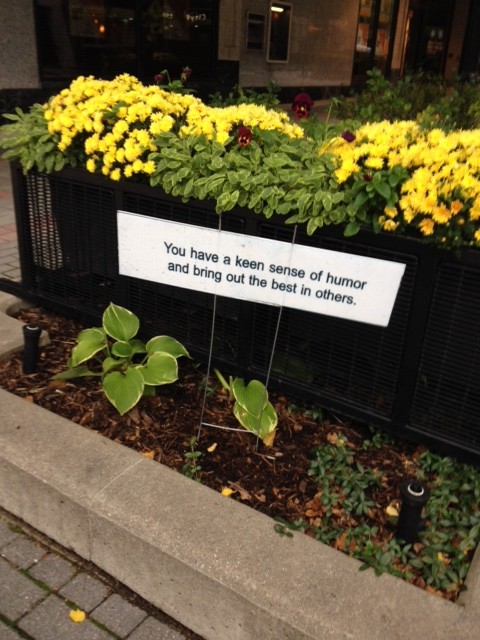
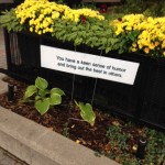
Grand Rapids, huh? For those folks NOT from the region, this may conjure up vague associations with cold weather, lake effects, and proximity to our Canadian neighbors in the north. I was surprised to find instead a city whose downtown was quite a bit more developed than Knoxville, at least 25% more populous, and FULL OF DESIGN.
There’s an art school there: Kendall College of Art and Design. It’s pretty big, pretty modern, and housed in some pretty swanky digs.
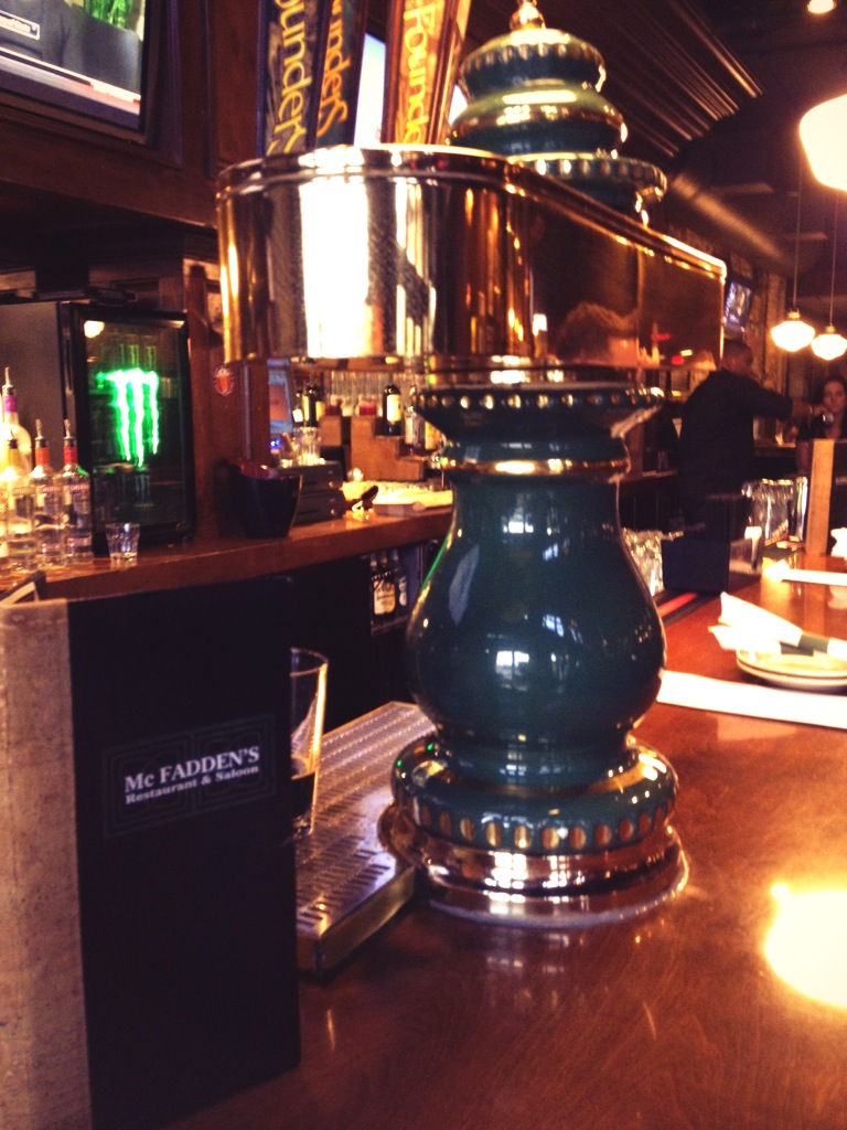
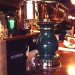
There’s a lot of really good beer here, too. Also some whisky, burgers and arcade games. I can vouch for the first two bits there.
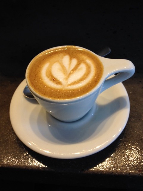
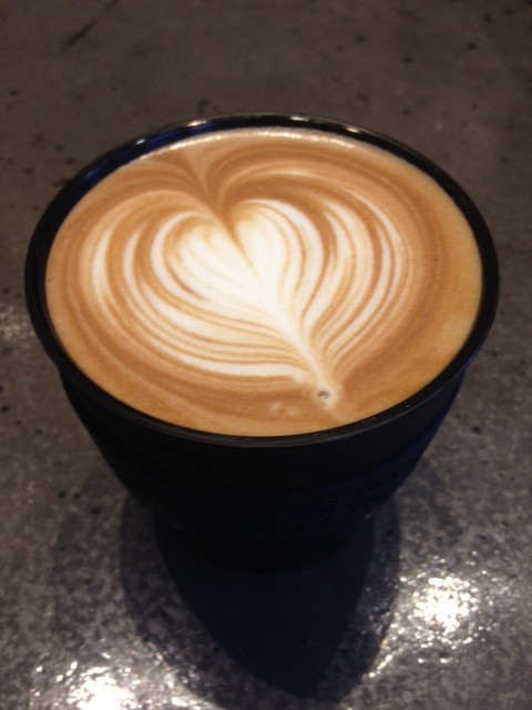
There’s also some really good coffee here. The first day, we hit Biggby’s Coffee. It wasn’t bad – better than average coffee, but nothing life changing. The second day I went to Madcap Coffee. If I could, I would teleport there and back every morning from now on. I would marry their machiatto, but polygamy isn’t legal in Michigan or Tennessee. I wasn’t the only one either – fellow drinkers would note the cups held by other attendees and simply raise them up and wordlessly acknowledge the religious experience we shared.

Also a great art museum. More on that in a moment.
Impressed with the pre-conference work
Every point of contact I had with the conference was well designed, well managed and question-free. Seriously. I had no questions after reading the website. Signing up for the conference triggered confirmations, friendly advice about the city and venues, and timely reminders and new info via email and the website as it became available.
Impressed with the conference logistics
Again, no questions. No drama. No issues with instructions, with missing presenters, with spotty Wi-Fi, or unclear directions. There were volunteers stationed for maximum effect to direct foot traffic between buildings and events, signage up everywhere you could need it to be, and things ran on time across the board. It was almost spooky.
The food and beverages provided at certain points were fresh, plentiful, tasty, and served with 100% recyclable or compostable materials. There was next to no waste produced by this event.
The sessions and workshops themselves comprised a nice mix of disciplines and interests, though I had a couple hard decisions to make.
Session notes
Thursday
I missed a great workshop on drawing communication practices by MJ Broadbent, but enjoyed a workshop on design practice led by Matt Nish-Lipidus. Given the simple task of coming up with a clock that describes one’s relationship to time, there was a surprising variety in what our breakout teams came up with.
Since I covered all costs myself versus having the conference/travel paid for by my company, I opted to only do one workshop. After lunch I headed to the GRAM, or Grand Rapids Art Museum. There I enjoyed the permanent collections as well as a few remnants from the ArtPrize event they apparently have each year in Grand Rapids. There’s a very well put together art library within the museum as well.
Friday
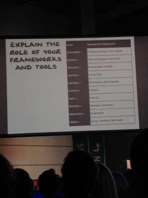
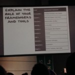
Abby Covert’s keynote on “Making Sense of Place” did not disappoint. I’d heard a bit about her, and I can see how she’s got the reputation of being a smart, kind, and energetic designer and presenter. Her talk focused on relating IA (information architecture) specifically and UX as a whole to the theme of ‘place’, and place making. Aside from her amusingly caffeinated story, she presented a hierarchy of terms to make sense of a given design challenge, and how to zoom in and out of that hierarchical framework to gain insights. Ecosystem to Object – from a simple object like a button up to a complex collection of systems like a large pharmaceutical company.
Dude, Who Stole My Community
Charles Erdman led an interesting session that focused on how our developing technology and our dependence/addiction to it has effected our sense of community. From I Forgot My Phone to stories of how technology helped keep communities in touch during the recent Colorado flooding, he made some good points for designers to consider carefully when using and building future products and systems.
After orientation: making room for a novice UX designer
Megan Schwartz had a lot of really sensible things to say about how organizations can better support (and learn from) novice designers. Some of it was common sense (though not necessarily practiced in the workplace very often) but her insights into the ways novices can turn the tables and really help a company out were interesting. As a manager myself I took away some notes I intend to put into practice. Good job, Megan!
Excursion
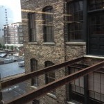
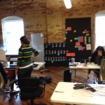
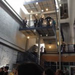
I joined a gaggle of folks and we soon arrived at GRID70, a coworking space shared by a number of non-competitive companies with roots in Grand Rapids. Here’s the description:
GRid70 is currently the world’s largest experiment in coworking which brings innovation and strategy teams from Steelcase, Amway, Wolverine Worldwide, and Meijer together in shared spaces. This Excursion focuses on ways space can be designed to create the “happy accidents” of collaboration essential to fostering new work structures and inter-industry collaboration. The participants will engage in a conversation about Grid70 – what it is, how it works, and the challenges it addresses. The Excursion will culminate with an exercise to expand the concepts discussed and deconstruct a proposed experience solution.
First we talked about the space itself, the groups working there, and the mindset that brought it all together. Then we toured the building, poked around the collaborative workspaces, and generally grew quite jealous of their marvelous workspace. Finally we got back together and tossed around ideas on how to achieve a sense of community in Amway’s international physical storefronts – designed to be a coworking space, a distribution point for merchandise and a support structure for the independent business owners. It was a fun outing to be sure.
Keynote #2 by Christina Wodtke
Another well-known figure in the UX community, Christina had some nifty insights to share about Place. For one, stop thinking purely in terms of how you as a builder are creating spaces. Stop and think about how places make you. Places, communities, heartlands.
Another insight was to consider carefully how a user’s speed of browsing should be consciously designed for… on a social site’s homepage when NOT logged in, you might design for high speed ingestion – users will likely only see the page for a brief moment and can scan a well designed page quickly to find what they need. Contrast this with a comments feed from friends – this highly dense information must be put together so that one’s low speed browsing experience is optimized. If the internet is our new third space (since bowling alleys are nearly extinct and not everyone likes Starbucks), what is the internet’s heartland?
Saturday
In the morning, Christina chaired a panel (you’ll see what I did there in a sec) with design leads from Steelcase, Herman Miller and Haworth. Each had brought a chair with them (and sat on it for the duration) that exemplified the design philosophy their company was known for. It was rather cool seeing three competitors on the stage at once, sharing some challenges and some lessons learned that they found they had in common. Everyone in the crowd wanted those chairs… badly.
Lunch was served, and some of us chose to take in some quick lightning sessions in a format called Pecha Kucha. I caught three of them, and resolved to take part the next time we have a Pecha Kucha night in Knoxville.
After lunch, I took in a thought provoking session about the Essence of Experience (Design can be dangerous), and another on how “The Place You’re In Is More Than The Place You’re At” by Phillip Hunter.
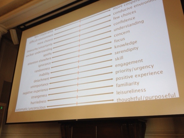
A takeaway for me was Phillip’s comprehensive list of different continuums – a sliding scale indicating ‘more’ or ‘less’, ‘hot’ or ‘cold’ as related to user experience evaluations. This isn’t a list of good and bad, just a way to think about a product or service to ensure you’re designing with the right factors in mind. Stay tuned for tweaks to this – I think he said it was still in beta 🙂
Finally, the closing keynote began, featuring Karl Fast. I had the pleasure of sharing lunch with Karl and two other gentleman before the excursion to Grid70, and his insights into the state of UX education, MOOCs, and technology trends had me wishing we could have a longer lunch.
Karl’s talk led from physics to astronomy to electronics to biofeedback to data. BIG DATA is all well and good, but Karl exposed us to the idea that SMALL DATA is where we as designers can build experiences and leverage the growing sea of data to improve the lives of individuals, at a local scope, in real and measurable ways. He’s a great speaker and a very sharp fella.
The conference closed out with credit to volunteers, sponsors, organizers, and attendees. Lots of genuine applause and positive feedback – (I wasn’t the only one to feel like the logistics for MidwestUX were flawless.)
I had a blast. It felt so good to talk design and experience again with folks from all over engaged in all sorts of roles. Invigorating, exciting… like a Zest commercial with empathy and a sense of place.
On the way out of the city, I dropped by to say a sad goodbye to my new sweetheart: goodbye, MadCap. And goodbye, Grand Rapids! I hope to see you in Indy next year, MWUX!